Silver Globe Pitcher: Contour Drawing
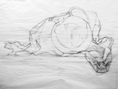 Contour drawing for Globe Pitcher
pencil on (wrinkled) trace paper
16 x 20 inches
After completing my small 8-inch value sketch, I began a full-size contour drawing of my subject at the actual size I will paint it. And I immediately ran into a problem. The proportions of my small drawing were not exactly the same as my 16 x 20 inch panel. And also, the composition I had sketched small, once blown up would require me to paint the pitcher huge, larger than it is in real life.
So even though the composition looked nice in the sketch, the larger scale made it look overwhelming, way too big. There's a lesson in here.
It's a change for me to paint this big. The previous paintings in this "Wax Paper" series are 11 x 14 inches and 12 x 12 inches. So 16 x 20 is a HUGE leap. It may not sound much bigger, but to me it's enormous. This is the problem with blogs... there's no sense of scale.
You'll also notice the left side of the crumpled wax paper has a new shape. I decided it looked better if it angled up at the left, instead of tapering down and to a point, running off the left into infinity.... So I crumpled up the wax paper on one side (gently) and altered the composition.
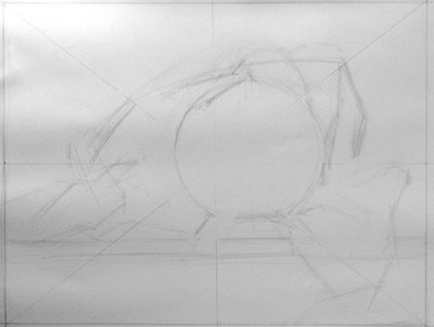 contour drawing phase 1
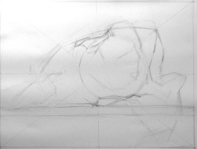 contour drawing phase 2
 contour drawing phase 3
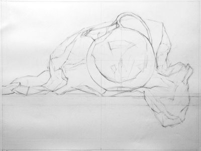 contour drawing phase 4contour drawing final
I've drawn the final version on trace paper so I can transfer to the gessoed panel. I usually draw directly on the panel, but since I labored so hard to gesso them so perfectly, I was afraid of dinging or marring the perfect surface with a lot of erasing. So I nearly finalized the contour drawing on paper before transferring it.
As an final note, I'd love to draw your attention to this hi-LAR-ious blog entry by an abstract painter who says, in part:
"...what’s so hard about painting a realist painting nowadays, when even a no-talent can transfer images and paint textures straight from a computer to a canvas?"
To which I nearly choked, as you can imagine. Laurie Fendrich, I sure hope you find my link to your two posts on the superiority of abstract painting to realist painting, so you take a good look at my blog here and see that realist painting takes quite a bit of study and work, even "nowadays".
Oh, and especially note the parts about how the Old Masters used optical devices, implication being that anyone with a lens and a grid could have produced the masterworks of art history.
Le sigh....
----
 View Printer Friendly Version
Reader Comments (9)
The way scale messes with you is partly why I start my compositions at actual size. I do thumbnails for positioning large masses of things, but they are basically blobs, nothing more detailed than that.
The step I was missing is to then go back to small-scale studies for value and color, but for composing, I actually start with deciding whether something is life-size, smaller than life or larger than life, and figure out the dimensions of the picture from there. Like with the stacked women I'm working on, I thought first about how big I wanted the faces to be, and consequently how big the bodies would be. Then I thought about where the key movements and focal elements would be in relation to the picture edge - how close to zoom in. And that dictated the size of the paper I picked to work with.
I'm hesitant to click on those links because I think I might get an annoyance embolism :-D
"Multiple technologies — the camera, in particular — have lessened the meaning and awe we derive from hand-wrought visual imitations of nature."
Sez you, sister! This is like arguing that mass-produced furniture lessens the meaning and awe we derive from seeing pieces that are handmade by master craftspeople. I would argue, in fact, that these technological advances have had the OPPOSITE effect: That we are now even more in awe of things done "the old-fashioned way," if for no other reason than that they are so rare. Today, in the era of iPods, we're astonished to hear someone we know, who isn't a professional musician, sit down and play a competent piece on the piano or the violin. A hundred years ago, that was commonplace (since you HAD to make your own music if you wanted to hear it). Likewise, the explosion of digital photography has only made photographs captured on film even more rare and precious.
Just because you write for the Chronicle of Higher Education doesn't mean you have all the answers. Or much perspective on reality.
"Like many artists, I knew from an early age that I had an innate ability to draw realistically. I could always make a doggie look like a doggie. In my “lab” high school on a college campus, I drew alongside college students in their life drawing classes. In my own college drawing classes I could make doggies look even more like doggies than when I was in third grade, and do pretty accurate portraits of people."
Pardon me while I gag. The rest of us poor sods just have to plod along, WORKING at our craft in order to improve.
It's been rightfully pointed out to me that Ms. Fendrich's point in her article was not that abstraction is superior to realism, as I mis-categorized it in my post last night. She wrote on an entirely different topic, and my reaction was to a few asides she made.
I feel I was overly emotional in my response to her article last night (although I have to agree with the outrage to the craftsmanship point Matt just expressed).
I will say, it is deeply annoying that the "serious" art world has long marginalized realism and lumps it all together as schlock, or "already been done". When I was an art student in the early 90's I believed it and was overly swayed by it and it cost me dearly. I was immature and overly affected by it, because there were (unknown to me) artist students in my generation who soldiered on studying the old masters while I abandoned painting completely (and several of those artists are now my teachers).
So I'm frustrated that I didn't have the support of a realist painting community like I do now, and I am frustrated at myself for being influenced by the zeitgeist. So when an abstract painter, who knows nothing about realism, writes about how "easy" realism is with modern tools, and defines realism as "Making art based on the skills of imitation", and describes Classical Realism as making art that is "clichéd, sentimental, or just plain inert, that it's painful to the eye and soul", I have a strong defensive emotional reaction. I feel like this is the unspoken message I've had fed to me all my life, and to read it in print makes me gnash my teeth a bit.
But in fact, at the end of her article, she makes her best point: "Look people, good art of any kind is difficult enough to make, to find, and to derive meaning from, without having to first make your way through unnecessary categorical roadblocks." If she could have kept it at that, there would have been no teeth-gnashing from me.
Spatula, I totally agree and that's really helpful. It makes much more sense to do value sketches again once I have the large composition worked out.
The problem I run into is, in order to get a strong feeling for a composition you have to have the values, and it takes a very long time to do value studies at full size.
But some back and forth, from large to small, would be helpful in imagining the "final feeling" of a painting before I begin hours (weeks) of painting.
It would have been really helpful, as you say you do with your women's faces, to decide how large I want my central object to be, and work out the composition from there. I'll have to keep that in mind :)
As for the links: The articles aren't as annoying as I categorized them, there's just a few zingers sprinkled around.
"The problem I run into is, in order to get a strong feeling for a composition you have to have the values, and it takes a very long time to do value studies at full size.
But some back and forth, from large to small, would be helpful in imagining the "final feeling" of a painting before I begin hours (weeks) of painting."
Yeah, I think maybe the best thing is a kind of jumping back and forth process. Make decisions in thumbnails, test them full-size, run into problems, fix them, rethinking the whole through thumbnails as needed, rinse and repeat :-D
I personally hate charcoal - just a sensory dislike of how it sounds when it hits the paper, and how it feels on my fingers - but I grudgingly admit it might be a good way to work out values quickly.
Process is such an important tool. Sometimes I think just having a handle on what steps to take in order to make a picture counts for at least 50% of whether it goes well or not.
About charcoal drawing versus pencil - Michael Grimaldi uses them both in a drawing, something that never occurred to me. (always pencil over charcoal; charcoal won't stick to a shiny graphite surface)
So I've collected a jar of my charcoal and graphite dust (because I sharpen both by rubbing on sandpaper inside a plastic bag). And for this value sketch I first dipped a shami cloth in the charcoal dust and created a bed of tone on the paper to work into. After that I mostly used pencil (and eraser).
It made building up value go much faster for the value pencil sketch. And also, you get more control with a pencil than with charcoal.
Whoah, that's an awesome technique. I'm going to try that. I use charcoal dust for making paper to canvas transfers, only I use a mug to collect it :-)
I agree the dry skritchiness of charcoal can be a less than seductive art material. But if you use it as a misty, velvety ground, pushing and pulling lights and darks out of it, refining it with a sharp pencil, it's quite fun to manipulate, and yields very refined control of values.
Grimaldi shows a true love affair with charcoal and graphite with his drawings:
http://www.michaelgrimaldi.net/Drawings.html
Have fun :)
I know! I'll be an abstract realist. You're right it was hilarious.