The exhibit was two small rooms, only about a dozen works, but it showed a good variety from early and late periods in Corot's career, both sketches and highly finished works. It was exactly what I came to see, because I wanted to get a close look at how the paint is layered.


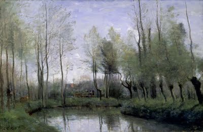
This is my thumbnail sketch of a painting called "
The Water Trough at St. Omer" from the 1860's, but unfortunately I can't find a photo of it online. Most my notes were based on this painting because although it's a finished work done in the studio, it had patches where the underpainting was visible in some areas.
These are my notes for how I believe Corot built a painting:
Stage 1: Block in main light and dark of composition
1. Start with middle-value toned canvas in warm umber, not too light nor too dark
(may have mapped out composition with a contour drawing using a small round brush, but those lines are not visible.)
2. Shadow values: Mass in thin, colored underpainting ebauche of the large dark masses, mainly greens and browns (brightly lit mid-day scenes seem to have a lavender-grey underpainting).
- Underpainting darker value than middle-value canvas ground.
- Ground plane and foliage of trees laid in with careful drawing, using small bristle brush.
- NO tree trunks, branches, individual leaves, or details.
- Allow to dry (thin paint probably dried quickly, within the first session).
3. Light values - Mass in light areas, eg water and sky: Thin paint, soft at edges.
- Sky background: ultramarine at top, cobalt or cerulean next, down to white, painted in gradation down to horizon, pinks at horizon if a sunrise.
- Use light areas to refine shapes of dark areas. Careful painting around architecture and other firm lines. Still, no hard edges, very small value differences to create edges.
4. Cloud shadows painted in exact same value as sky underneath, slightly warmer neutral hue than sky. No light clouds yet.
5. Allow to dry
Stage 2: Middle values and color
6. Add color: thin paint, glazes maybe, slightly lighter values to mass in lighter values of greens in trees, areas where light hits foliage. Allow ebauche underpainting to show through in shadows, esp ground plane.
7. Tree trunks and branches: indicate with thin, transparent paint, harder edges.
8. Sky: paint clouds by building up lights to whitest whites, use thicker brushstrokes.
9. Allow to dry
Stage 3: Details and finishing glazes
10. Paint transparent umbers and blues over sky to unify color variations, but use individual brushstrokes, not completely smooth. Glaze very thin umber over thick whites strokes, wipe away, to give volume to brushstrokes.
11. Final pass of details in both dark and light
- Paint darkest accents, small areas of deep shadow in black
- Thin, transparent tree trunks, very thin branches and dabs of leaves in transparent paint
- Tree trunks are different values from each other, and different values from top to bottom. Some tree trunks have white added to bring forward, some are transparent and sky shows through, some are opaque.
- Small dabs of leaves and flowers in green, yellow, brown, white, both lighter and darker than background
- A couple tiny red dabs
- Final pass of glaze on sky, neutral grey-blue to unify
Notes:
- Sky is always lighter than reflecting water
- Tree trunks are darkest where most branches cluster
View of Rome, Bridge and Castle of St Angelo w/ Cupola of St. Peter's 1826-28
1. Middle value canvas, warm hue
2. Shadows: Main masses blocked in with a wash of cool neutral (lavender?) shadow hue, careful contours
3 Lights: Sky, water blocked in, careful contours
4 Middle values laid over dry underpainting (e.g. light half of cupola laid over shadow)
5 Darkest accents
6 Lightest lights, small touches
Note: Area of highest contrast is focal point of composition: more refined detail, lights and darks laid down next to one another
This is all my best guess... if you know of how Corot worked, please tell me!

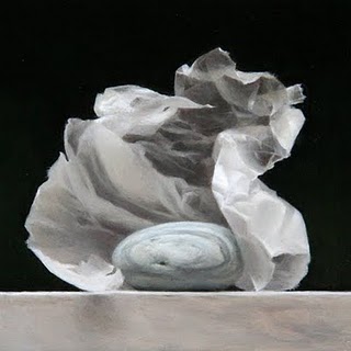
 The sensitive observation of even simple objects can yield dramatic paintings. Working in oil paint on gessoed panel, students will learn the refined glazing and layering techniques to render the most subtle effects of light. Beginning with a drawing on paper transferred to smooth panel, we will paint open grisaille, closed grisaille, opaque layering, and finally glazing to create highly refined images.
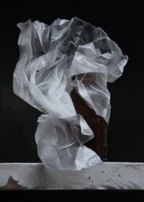


 My husband and I drove down to Santa Barbara for the weekend to see the current exhibit at the