Tuesday
May122009
Bottle Collection: Overpainting II

detail in progress
It's always satisfying to bring at least a small area of the painting up to the highest degree of finish I can manage. Here are previous stages of this area of the larger painting:
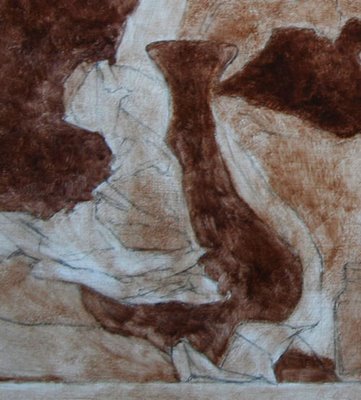

I'm pretty happy with it at this stage, although for several painting sessions I was really struggling over the brightest areas of wax paper in front. It's always hardest for me to figure out how to paint an area with lots of bright highlights.
I've been thinking about highlights and why they are so difficult. They are not, as we are sometimes taught, simply the lightest areas. In fact, in order to paint convincing highlights, I find I have to paint the entire form without the highlights first. Highlights behave in a completely different way than the rest of the light.
I think understand why: unlike other light effects, the highlights are reflections the way a mirror is a reflection. So light is not merely bouncing off the surface, but there is a depth to the highlight. It's actually hitting a different plane of vision, so we actually re-focus our eyes to see a highlight.
Which is why it is so hard to paint highlights: we are trying to capture a stereoscopic effect. Our eyes can perceive depth in real life, but a painting is merely the illusion of depth.
 View Printer Friendly Version
Reader Comments (9)
Beautifully put Sadie. The question is how does one get depth into a highlight. No one answer i guess, having just painted a bottle with reflections highlights etc, i am now worried! The painting is beautiful, there is so much air around the vase that paper doesn't suffocate it, just wonderful. r.
When I look at this image I see echoes of your "Winged Victory" drawing. Really like the feeling of this piece. Nice contrasts of values and textures here.
Your art is a-m-a-z-i-n-g.
There is a nice feeling of *bulk* in the paper, so I think you were very successful about conveying the overall volume as well as all the delicate folds. Which I find very tricky to pull off!
On the highlights, Bill Rogers was telling us the other day to think of light as rain, so it hits the form and bounces off, and the angle of the bounce is different depending on how the form is turning away from the light source. He said, the highlight is where the rain drop bounces off the form right in your eye!
He also said that the highlight is separate from the rest of the light because it's not so much ON the form as in your eye, because if you move around the object, the light on it doesn't change, but the highlight moves with you. So it's its own little weird optical entity.
Michael Siegel's tip re. highlights is that they have to have a hard edge where they really cut away from the form, and a softer edge where they merge back into it. Depending on where you choose to put the contrast vs. the softness, you get to lead the viewer's eye and suggest direction as well as volume.
I'm just full of learnin' these days. *burp*
Spatula yes, Ted Seth Jacobs also taught the idea that the highlight "follows" you as you move, which is what got me started thinking about it. I like he concept of it bouncing right into your eye that's what it feels like certainly. Highlights are just so non-intuitive to paint, I assume that if I get the shape and placement correct it should look like a highlight but no! You are right, paying attention to soft/hard edges is key.
Rahina yes, depth is the issue, since we paint all n the same plane! I've noticed if I look directly at the highlight the object doubles in my vision, and if I look at the object the highlight doubles. That means it's hitting a different picture plane, as if the highlight is actually floating in front or deep within. like a mirror. I think the only tool the painter has to simulate this is edge control. I'll let you know if I figure out another technique.
Candace, thank you, someone else said the same to me recently. It may the the reverse though - all my studies of wax paper are sort of drapery studies, which influenced how I treated the draperies in Winged Victory! I do like to think that my still lifes are secretly figurative.... although not literally of course.
Edge control? Is that the same thing that Spatula was talking about?
Yeah, just controlling which edges are soft and which are crisp :)
What an extraordinary talent! I caught my breathe when I saw your work! A fantastic exploration - really inspiring and beautiful. The waxed paper pieces really break new territory - absolutely in the tradition of fabric studies but with a totally original motif. Many, many congratulations on your work! And thank you, I believe you are one of the people responsible for the Women Painting Women blog? I really enjoyed the work and would love to look in to contributing at some point. Much continued success and all good things to you, Aliaena
Alaena thank you so much for your comments!
Yes I did start the Women Painting Women blog, please let me know if you'd like to be a contributor, I need help to continue to maintain it :)
-Sadie